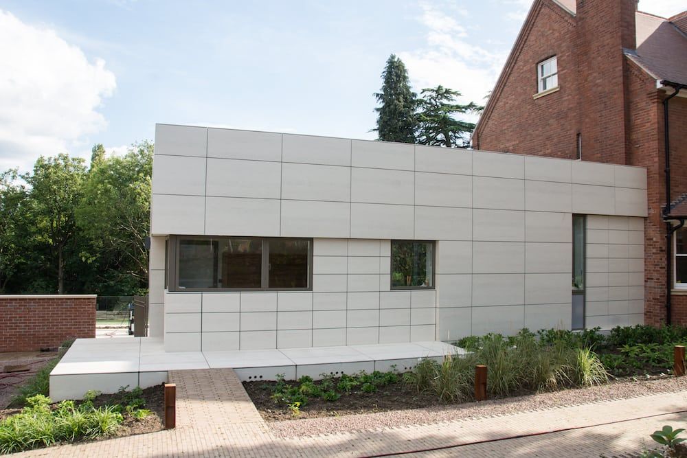
This garish Lego brick-style house has been nominated for the unflattering crown of Britain’s UGLIEST building.
The four storey Victorian villa – which has a pitched tiled roof, decorative stone facades and light cream steps – looks from certain angles to be a picturesque, historic property.
However, neighbours were left in horror when the owners erected a huge extension – which locals say resembles a light industrial unit – in July this year.
The vast rectangular box was put together using engineered stone tiles in a stack bond arrangement, and contains a living area and kitchen.
In the planning application, it was stated that the stone clad extension would be “subservient and understated with a crisp modern aesthetic distinct from the historic house”.
The new extension, along with the refurbishment to the original house, was designed by Vivid Architects.
The building is one of seven to be nominated for this year’s Carbuncle Cup – an architecture industry ‘prize’ given out by magazine Building Design to the ugliest building to be completed in the past year.
This year’s winner is set to the announced on Wednesday (6/9).
Robert Smith, who nominated the house in Malvern, Worcs., said: “The property is situated in a lovely, tree-lined street dominated by Victorian architecture, in a conservation area.
“The house itself is believed to have been constructed during the late 1800’s, principally of brick, under a pitched tiled roof with part stone decorative facades.
“Whilst the owners are in many ways to be congratulated in taking on such a large restoration project, it is the extension of the property through the addition of what can only be described as a Lego brick that is so offensive to the eye.
“To make matters worse, what cannot be seen from the photo is the fact that there was a Victorian single story building that was demolished to make way for the new monstrosity.
“I am aware that planning guidelines today are to keep a clear boundary between new and old structures, but the architect has made no attempt to unify the house and now most people assume this family home to be a medical centre.”
On social media, a host of users have hit out at the ugly design.
Debbie Jones said: “Some mixes of traditional and modern are amazing. But this, is awful (sorry to the owners). It is looks like a factory next to a beautiful house. I like an industrial look but this is not complementary.”
Sian Condor said: “When I think of the hard time we’ve been given over some of our planning applications in Malvern and they then allow something like this, it leaves me somewhat speechless!!!!”
Julie Bedington added: “Having walked past it a few times the white extension is awful. Also the white windows on the original part are shocking.
“This is just my opinion but looks so out of place in the lovely town I live in.”
A spokesperson from Vivid Architects was unable to give comment.