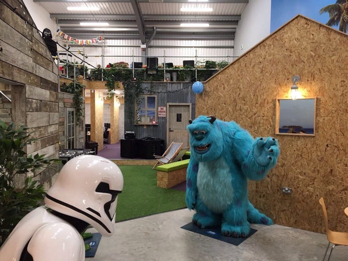
Invasion offices in Salford, Manchester. See Masons copy MNFUN: This boss must be one of Britain's best - giving his staff take as much holiday as they like, taking them to Vegas and even filling the office up with a gigantic BALL PIT. Lee McAteer, 32, set up his company Invasion in 2010 and says he wants to make his office the "most fun in the country". The spontaneous leader describes himself as a "big kid at heart" and likes to "constantly surprise" his team. Earlier this month he decided to fill his Manchester-based office with 250,000 brightly coloured plastic balls - and staff only found out when they arrived at work last Wednesday (May 3).
After Google introduced the world to its wacky slides a decade ago, a new era of interior office design was born. Many companies have since followed and started a kooky office trend, in hope of inspiring their staff and attracting the best talent – from the indoor forests of Fashion brand Misguided in Manchester, to the giant shoe house of Inventionland in the US.
So can a kooky office really benefit your staff, or is it counterproductive? Office interior design company, the Penketh Group, looks at the pros and cons of quirky office design.
Staff are a business’s key asset, so it makes sense to ensure your office is kitted out to accommodate your workforce the best way possible. At the basic end, an office should provide employees with a good and comfortable environment to work in and collaborate.
But at the top end, a well laid out, modern and exciting office can do so much more – helping inspire, aspire and motivate staff to achieve more. So can kooky office design achieve this too?
Physical movement to inspire
Physical movement fuels the brain, awakens the senses and make us more alert. So providing features in the office, which allow staff to be physically active, could make employees more creative and inspire some great ideas in the workplace. Research also shows the average worker spends 80,000 hours seated in their lifetime. So it makes sense to give staff the opportunity to be more active.
Online accounting solutions firm MYOB is an example of company with an office design that allows staff to be more active. The company, based in Australia, includes snooker tables and tennis tables, as well as running lanes and a mini basketball court.
Healthier, happier staff and higher productivity
With wellbeing and mental health being a strong focus in society today, it makes sense that companies want staff to be healthier and happier. Healthier and happier workers should lead to fewer staff off sick, a reduction in absenteeism pay and, as a result, higher productivity. A fun, colourful and refreshing office environment could contribute to achieving that. In fact, research shows that 60% of staff say working in a non-traditional office setting improves their productivity.
Australia’s Health insurer Medibank is a company that has focused on developing its offices to improve staff health and wellbeing. It’s kooky offices at Medibank Place, Melbourne, include green architecture, quirkily-shaped and colourful office rooms, a squash court. It also has a “vertical street” of stairs, with walkways so staff can socialise. The company reports that nearly 70% of their staff say they are more productive as a result of its quirky office design.
Distractive for staff
The first issue with a kooky design is the idea that it might be distractive, rather than inspiring, for staff. And distraction in the workplace is already a bit of a problem. Research shows that 25% of lost time in work productivity is due to distractions. Yes, it makes sense for workers to have different spaces in the office to inspire and refocus, but could something like bizarre artwork sat next to your desk, actually be counterproductive?
Danish Investment company Saxo Bank is an example of a business with quirky office features that could be distractive for some people. The bank’s HQ in Copenhagen has a series of strange sculptures fitted around the office. Amongst them are a nervous child perched on a diving board and a kneeling astronaut.
Mismatched with company culture
A kooky office design can be most effective when it reflects your company’s culture, while acting as an extension of the aspirational side of your business. This is especially good for creative companies, who take a lot of photos for their social media from the office. But while this can work well for toy or fashion brands, like Lego or Misguided, it doesn’t mean it’s right for a corporate business. This means a fancy office design could actually be a complete mismatch for some companies. It can also infer a lack of recognition for a workforce and create an unbalanced, uncomfortable and inauthentic workplace, as a result.
Swedish company Bahnhof is a company that some might feel has mismatched their offices with their culture and brand. The offices are built into a former anti-atomic shelter, with natural granite walls, resembling the look of a James Bond villain’s lair. A strange choice, perhaps for an internet provider.
Considering the above pro and cons, the answer to this question comes down to different factors: what kind of company you are; your brand, what you want to get from your staff; and your company culture.
But even with all this in mind, there are possibly more important elements that you should bring into your office space first. Perhaps your workers would prefer the availability of food and drink, for instance, or a better heating system, than an office slide or basketball court.
Research shows that the top three most important things in the office for British workers are comfort, temperature and light. So it’s probably best to get these things right before you make plans to build your first office seesaw.
Links: Penketh Group http://penkethgroup.com/
Pic Credit – SWNS