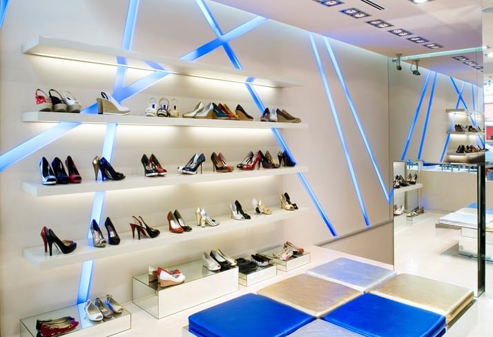
shoes store
Retail design has always been an integral part of business planning for a long time, with different approaches created décor experts or adopted by business owners. But some retail designs are popular because of their functionality and usefulness in generating more sales for the business.
Incorporating elements of art and innovation, modern retail stores now do a lot more than just attract potential customers into the office space. The ultimate goal is to hold and keep the client’s attention until they take the desired action.
But what innovations and artistic ideas drive modern retail designs and why are human compelled to behave the way they do when they enter a shop? Here are some tips offered by retail design specialists.
Paint an accent wall.
Coating one side of the retail store wall with a bold colour is not only a cheap and effective way to add interest to the space; it can also make it appear larger. According to HGTV design expert, Libby Langdon, painting an accent wall creates the illusion of a receding in space.
Another brilliant concept to achieve a similar effect is to put up nice looking wallpaper or some colorfully printed fabric. In addition, this will create textures and patterns that are lovely and be easy on the eyes for your customers or shoppers.
Also, you can consider using just two colours that resonate with your brand; the primary and secondary hue in the ratio 80% and 20% respectively. The primary colours will be used to create a calming atmosphere for shoppers to buy; while the secondary colour will be used to make the retail store’s décor pop. Secondary colours are ideally attention grabbers.
Light up your space in different creative ways.
The right kind and amount of lighting in your retail store is important, particularly in tight corners. Every corners needs to be well lit, so it doesn’t get lost in the mind of the customers. But have you ever thought that illuminating your retail store is only possible with light fixtures? Well, think again.
Naturally, when customers enter your store, one of the first things they will observe is the décor set. This set comprises all the visible elements from the walls to the floors, warm and bright colours, fixtures, wall design, posters and so on. Each element must work together to portray the beautiful story you want people to see.
A smart and eye-catchy concept is to use contemporary office design items such as Slatwall panels, accessories, shelving & hooks, leaflet holders & acrylic display, which can instantly trigger and enhance the brand personality.
Design with your customer’s comfort and convenience in mind
Consumer behaviour expert Paco Underhill coined the “butt-brush effect” principle, which says a typical shopper, especially women will avoid going after an item they want or are even interested in an aisle if they’re likely to brush another customer’s backside while doing do so or have their backside brushed.
Therefore, to avoid the chances of that kind of awkward scenario and lose significantly sales as a result, design your retail store floor, aisle, shelves and displays in a way that allows customers adequate personal space when checking out merchandise.
Also, make sure to position or design your check-out counter and POS at a natural stopping point for shoppers. The counter should be big enough for the customer to place their bags and/or personal belongings.
Lastly, remember to check them out and show good customer care at the check-out, for example, by politely asking if they were able to find everything they were looking for.
Modern retail design is a never-ending process. The key is to continue to tweak, innovate and get creative for a rewarding customer journey and experience.